HappySocks Guide Customisation
HappySocks is a Swedish fashion design company that sells amazing socks.
HELLO, HAPPY SOCKS
Happy Socks, a high-quality sock that combines unique designs and craftsmanship. (Probably) The world’s most comfortable and colourful tool for spreading happiness was born. This concept is now brought to life by Happy Socks’ talented team of creatives.
90 COUNTRIES AND COUNTING
Today, Happy Socks has reached 90 countries and every continent. With Concept Stores all around the world, from LA to Tokyo, Happy Socks can be found in over 10,000 top fashion apparel boutiques.
In this post I will take you on a journey where we discuss Guide features and best practices for HappySock’s Help Center/ Help desk user experience that we’ve customised. Come along!
Homepage

HappySocks Guide homepage design 2020

HappySocks main website homepage design 2020
The user experience is meant to be seamless for the users when they navigate to the support site and it looks pretty much the same. Yay!
Header with drop cool down. Most of the links in the homepage are external URLs that take the user to different parts of the main website.

Header with drop cool down. Most of the links in the Help desk homepage are external URLs that take the user to different parts of the main website.
Given that HappySocks offers support in over 15 languages, we had a lot of dynamic content to deal with.
TIP: The dynamic content placeholders can store HTML and CSS and are a great tool for whenever you want to inject some custom code for different features:
Changing the look and feel for working hours or in different languages or
Displaying contact options for different countries and their bank holidays
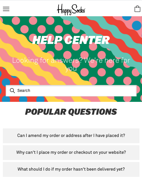
Popular questions
The 3 most clicked through articles. The CS managers decide which articles are the most relevant to be read by the users. Product updates, order details and billing issues are among some of the announcements that are relevant on a day to day basis. Your community can stay informed and be encouraged to visit the Help Center more often rather than directly sending in a request. Reducing the number of tickets is the end result and that’s awesome.
Statistically, 76% of users prefer to self serve rather than interacting with someone.
Post COVID world, am I right?
Also, your agents spend 20% of the time doing research to be able to answer incoming ticket requests.
Isn’t it lovely if agents no longer have to deal with repetitive tasks because you have these handled by your Knowledge base or an automated response AI like AnswerBot?
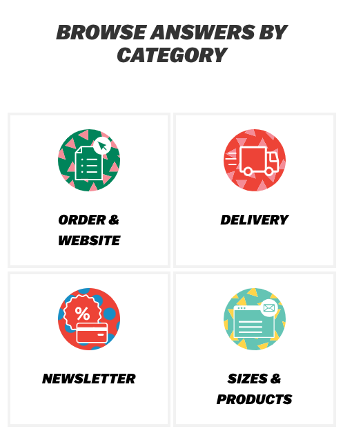
Category navigation with icons. These look super sexy and they are concise with the types of support requests that HappySocks are dealing with.

“Contact us” proposes and integration with a third party virtual assistant tool. The feature is great because it forces the user to give a synopsis of their issue which often times can be found in the form of an article in the Knowledge Base. After having tried some request types and the user has not found what they’re looking for, they are able to Contact a support agent.

This neat little trick deflects tickets, makes users happy and saves money.
The footer contains a lot of outside URLs that are related to the main website mostly. They are all dynamic content elements. Also the experience with the main website is seamless so great job done by us! Yay!
The email capture for the Newsletter is a third party tool to which we send a json query with the email that users send.
Language chooser

Category page

Left hand menu to make the user navigation experience smooth so they always know where they are.
Article page

Breadcrumbs menu to the user can navigate back to the homepage. Left menu for accessing the categories and Related Articles.
Mobile experience

In love with this hamburger menu

Homepage footer with navigation essential only features.
The challenge with the mobile/tablet experience was to port only essential features for navigation and not overcrowd the header and footer with all the main website links. Notice the hamburger menu (the one above in a blue gradient) has only the main website categories. Also the footer has very few elements in comparison to the desktop experience.